The Importance of Design and Aesthetics in Geospatial
When people think about geospatial technology, they often focus on the technical aspects—data accuracy, spatial analysis, and GIS programming. While these elements are critical, one essential factor that is frequently overlooked is design and aesthetics.
Well-designed geospatial tools help decision-makers absorb information quickly, improve situational awareness, and enhance user experiences. Good design can distinguish between confusion and clarity, whether a defense strategist analyzes battlefield terrain, an emergency responder navigates a crisis, or a city planner optimizes transportation networks.
The Intersection of Geospatial and Design
Geospatial technology has always been a blend of science and art. Traditional cartography relied on color, typography, and layout principles to create functional and visually appealing maps.
Today, with the rise of GIS applications and digital mapping, the need for strong design principles is more significant than ever.
In modern geospatial applications, UX (user experience) design plays a key role. Geospatial professionals must consider how users engage with spatial data when designing interactive maps, GIS dashboards, or mobile navigation apps. Even the most robust GIS tools can become difficult to interpret and use without thoughtful design.
Why Aesthetics Matter in Geospatial
Clarity & Readability
Geospatial data can be incredibly complex, containing multiple layers of information. A well-designed map or GIS interface simplifies this complexity, making it easier for users to extract insights.
For example, effective color contrast, symbol hierarchy, and clear labeling can ensure that critical information stands out at a glance.
User Engagement
Like a well-designed website keeps users engaged, an aesthetically pleasing map encourages interaction. Whether a public-facing web map or a military-grade GIS interface, users are more likely to explore and trust visually coherent and professionally designed information.
Decision-Making
Every second counts in public safety, defense, and disaster response. A well-designed geospatial interface allows decision-makers to process information faster, leading to more effective and timely responses. Poorly designed maps can lead to misinterpretations, delays, or costly mistakes.
Key Design Principles for Geospatial Professionals
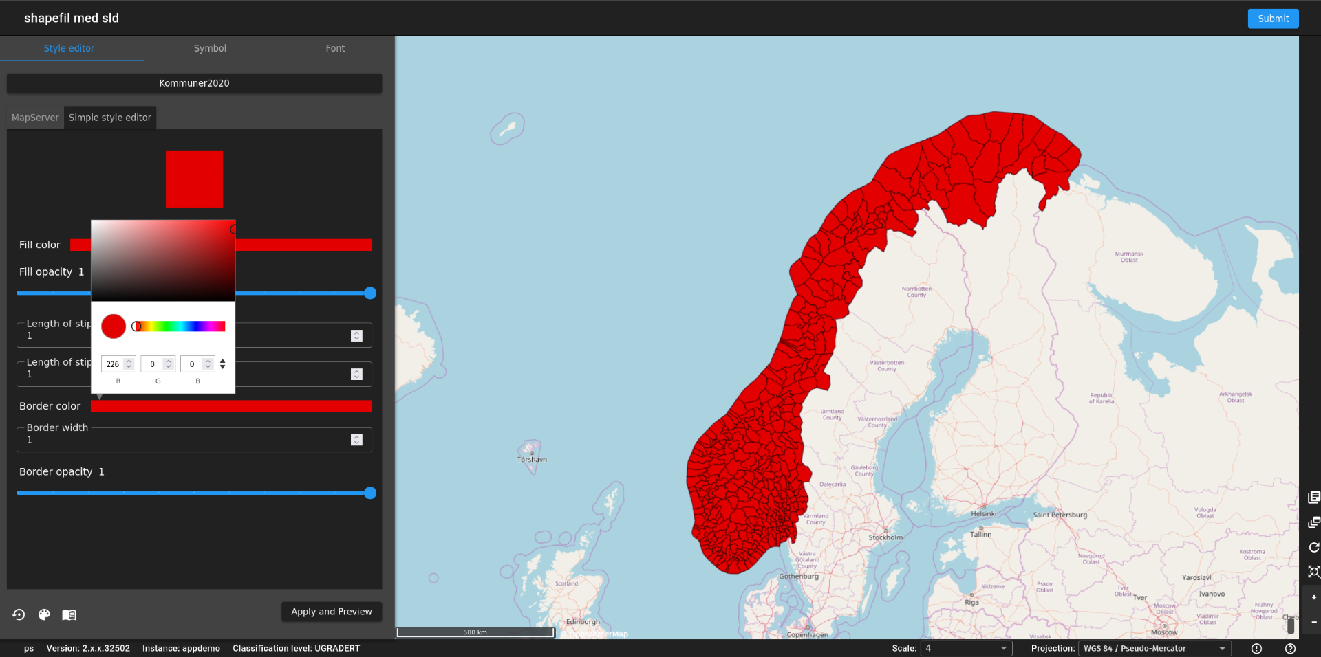
Color Theory in Mapping
Color is one of the most dynamic tools in geospatial design. Different hues can distinguish terrain types, population densities, or risk levels. However, it's essential to consider colorblind accessibility and avoid using too many colors, which can create confusion.
Typography & Labeling
The text on a map should be easy to read and positioned strategically. Labels should not overlap or clutter the visual space. Choosing the right font size and style ensures that information is legible without overwhelming the user.
Hierarchy & Emphasis
Not all data points are equally important. Design choices such as bolding key features, adjusting line thickness, and using size variations can help the user focus on the most relevant information.
Simplicity vs. Detail
A typical design challenge in geospatial applications is balancing detail with usability. Overloading a map with too much information can make it difficult to read, while oversimplifying it may leave out important context. Finding the right balance is key.
Real-World Applications of Design in Geospatial
Defense & Military Operations
Military and defense organizations rely on geospatial data for strategic planning and real-time decision-making. High-contrast, clearly labeled maps ensure that personnel can quickly assess terrain, threats, and movement patterns.
Public Safety & Emergency Response
Responders need immediate, actionable insights during disasters. Well-designed GIS dashboards can display live updates on hazards, evacuation routes, and resource distribution, improving response efficiency.
Wayfinding & Navigation
City wayfinding systems and transportation maps depend on intuitive design to help people navigate urban spaces. Effective wayfinding maps minimize confusion and improve accessibility for all users.
Environmental & Climate Mapping
Visualization is critical when presenting climate data. Thoughtfully designed climate maps can make abstract concepts like global temperature rise or deforestation trends more comprehensible, driving awareness and action.

The Role of Artists and Designers in Geospatial Teams
As geospatial technology advances, the need for design expertise is growing.
Many geospatial teams now include professionals with backgrounds in graphic design, UI/UX, and digital media. These experts help refine GIS interfaces, improve map readability, and enhance data visualization.
Collaboration between geospatial analysts and designers ensures the most effective presentation of data. A beautifully designed map is an aesthetically pleasing and compelling communication, analysis, and decision-making tool.
Collaborate With T-Kartor
By incorporating design principles, geospatial professionals can create tools that are not only functional but also visually compelling. As the industry evolves, the intersection of geospatial science and design will continue to shape how we interact with and understand the world around us.
T-Kartor provides high-security solutions for the public safety sector, enabling collaboration among public safety agencies, crisis management teams, and civil defense organizations through secure information sharing and decision support.
Reach out to our team today to learn more!